 Alexis Doreau
Chrono / MOBILITY · MONTRÉAL
Find your bearings.
Then your way.
A mobile transport experience connecting nearby services, metro lines and route guidance.
Product & interface design, with the project team
MOBILITY · MONTRÉAL
The context
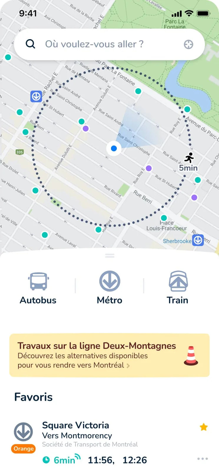
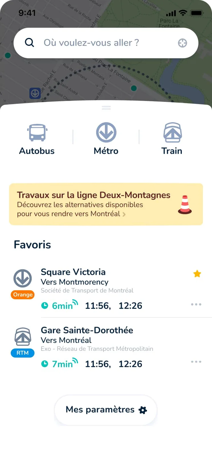
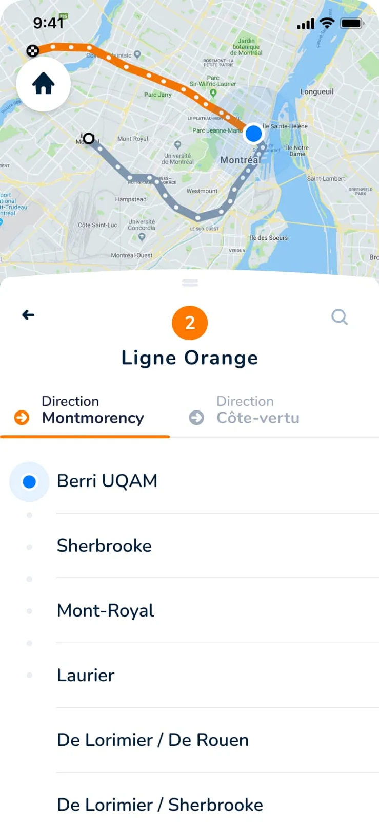
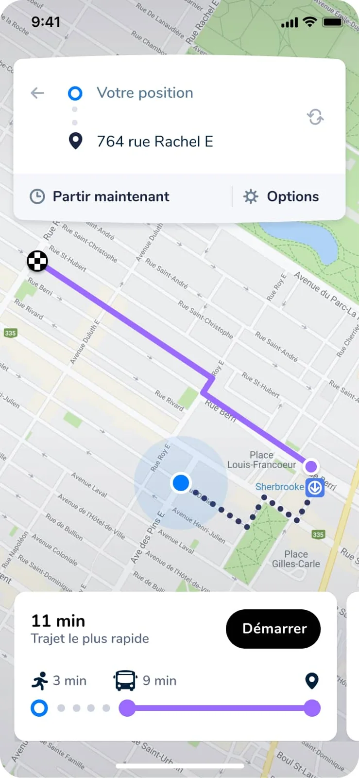
These design archives for Chrono, Montréal’s public transport app, show a progression from the map and nearby services to line information and a guided journey.
The question
Transport information has different levels of urgency: where am I, which line do I need, and what do I do next? The interface needs to keep the map and the next action connected.
Design decisions
01 — Start with the immediate surroundings.
The home screens combine a map, nearby stops, transport modes and saved places. A bottom panel allows the information to expand while preserving geographic context.
02 — Move from a network to a journey.
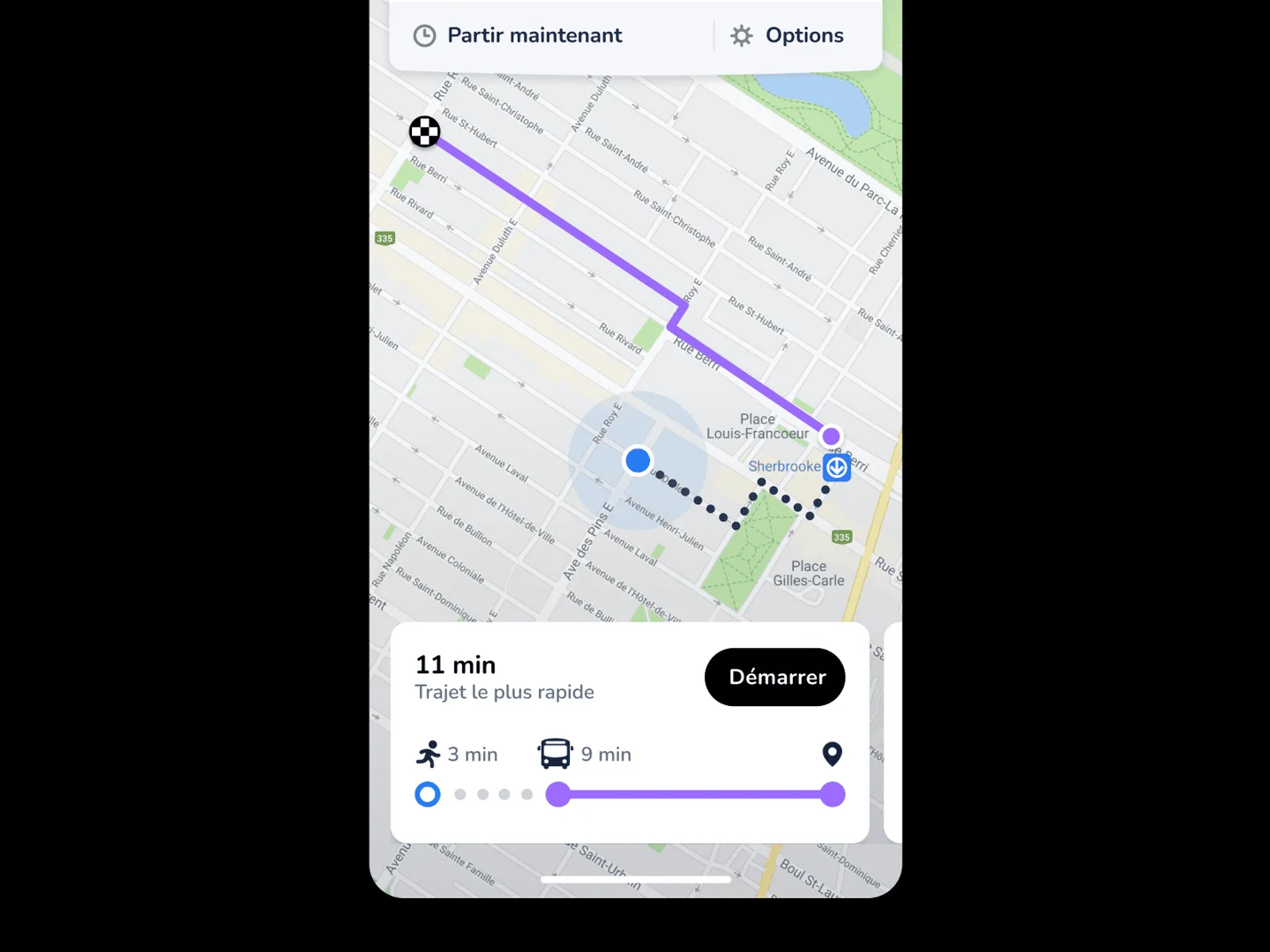
The metro screens expose the line and its stations. The itinerary view brings the next step forward, with the route remaining visible on the map.
Explore the screens
What I took from it
The selected screens illustrate a consistent hierarchy from geographic overview to the next step of a journey.